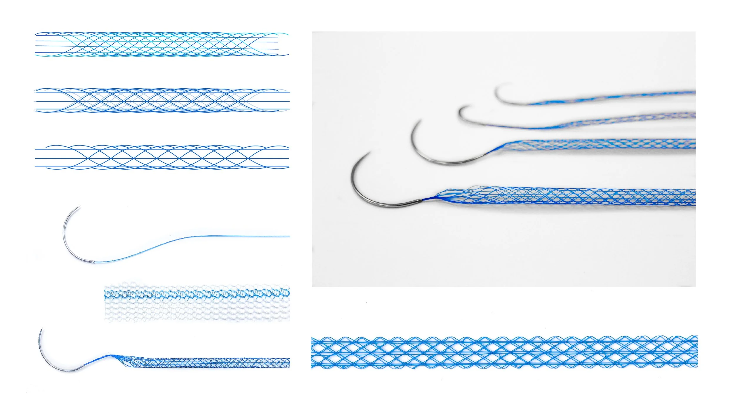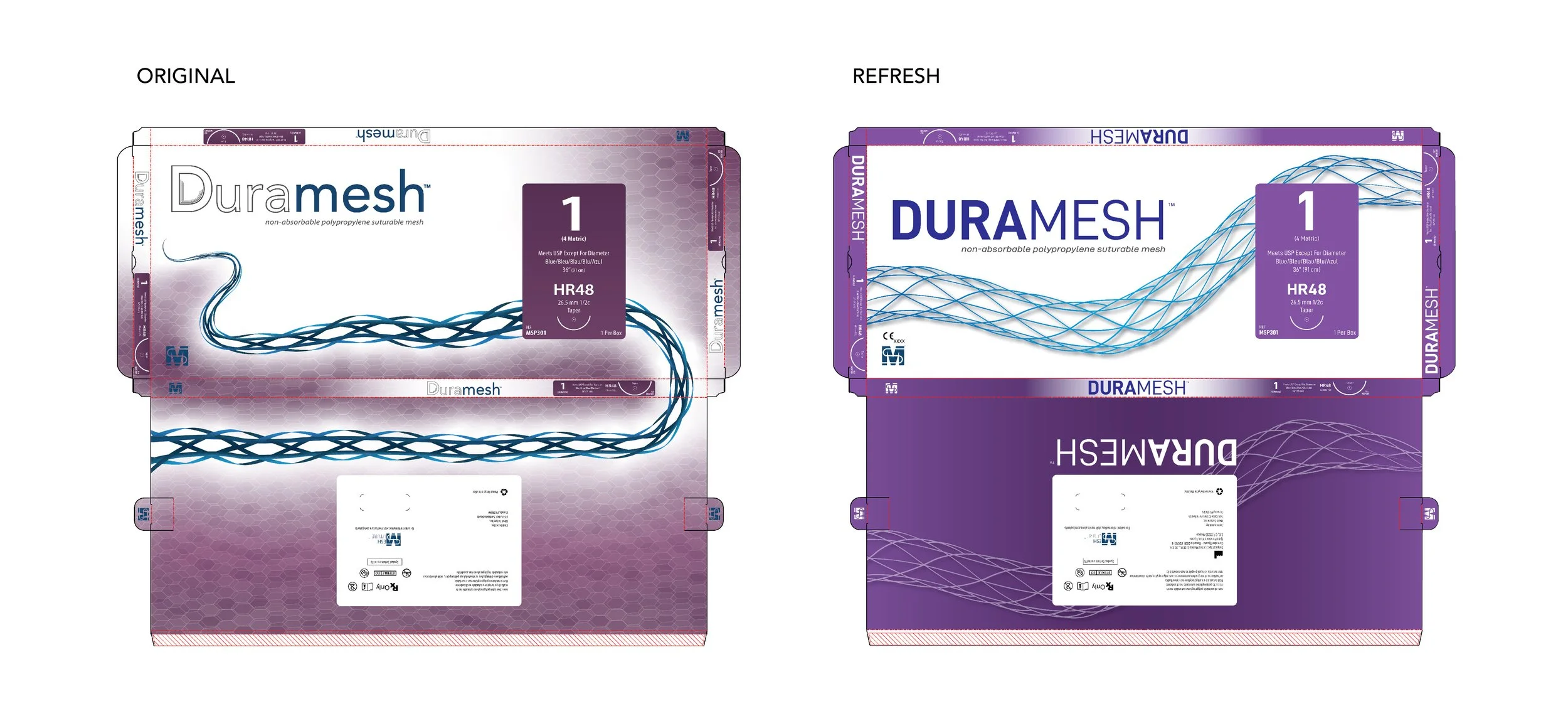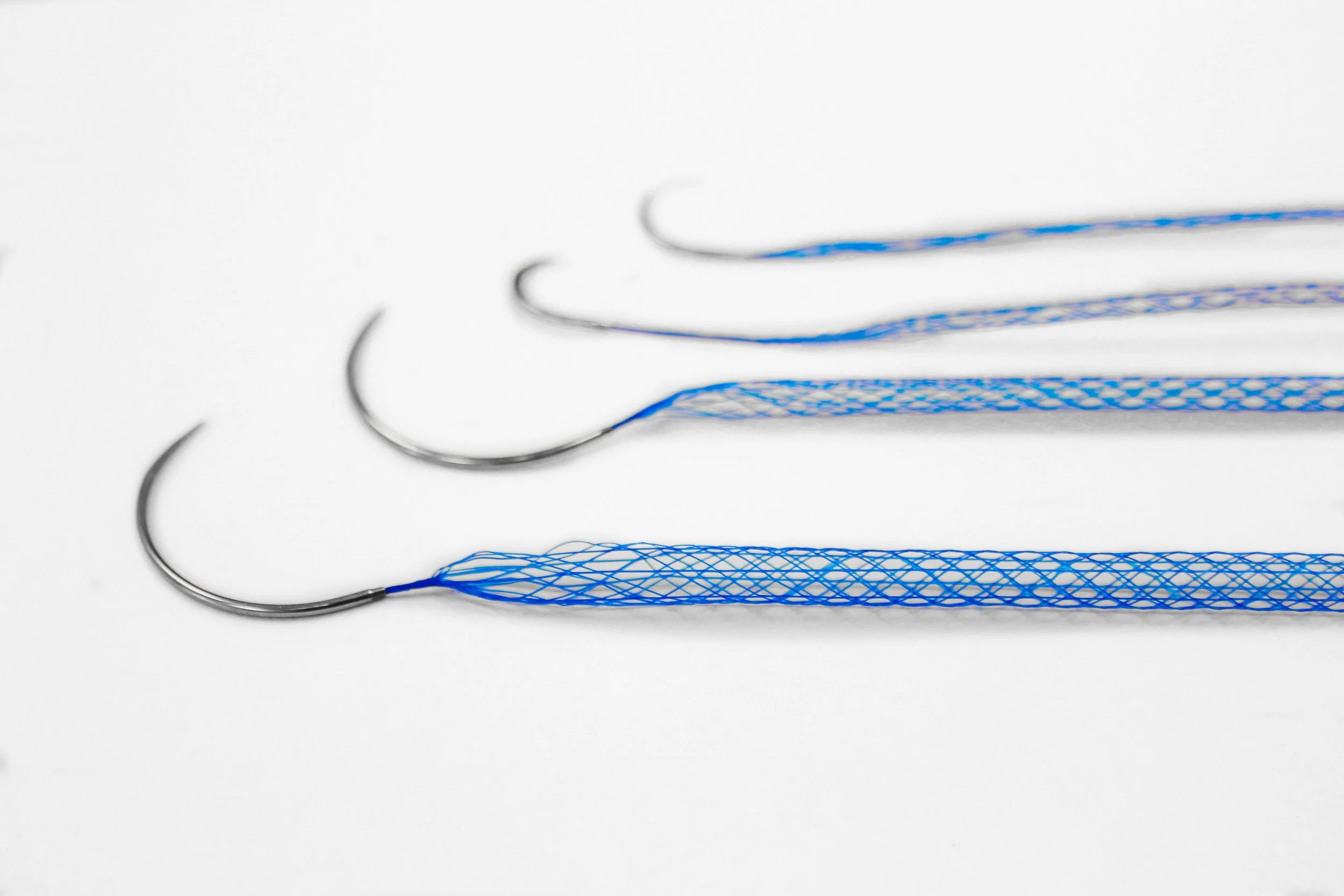
The team at Mesh Suture approached us seeking a brand and packaging system that reflected the modern engineering and innovation behind their DURAMESH product. Through extensive product research, visual analysis, and iterative color and packaging explorations, we developed a sleek, crisp, and contemporary design direction that aligned with the product’s advanced performance.
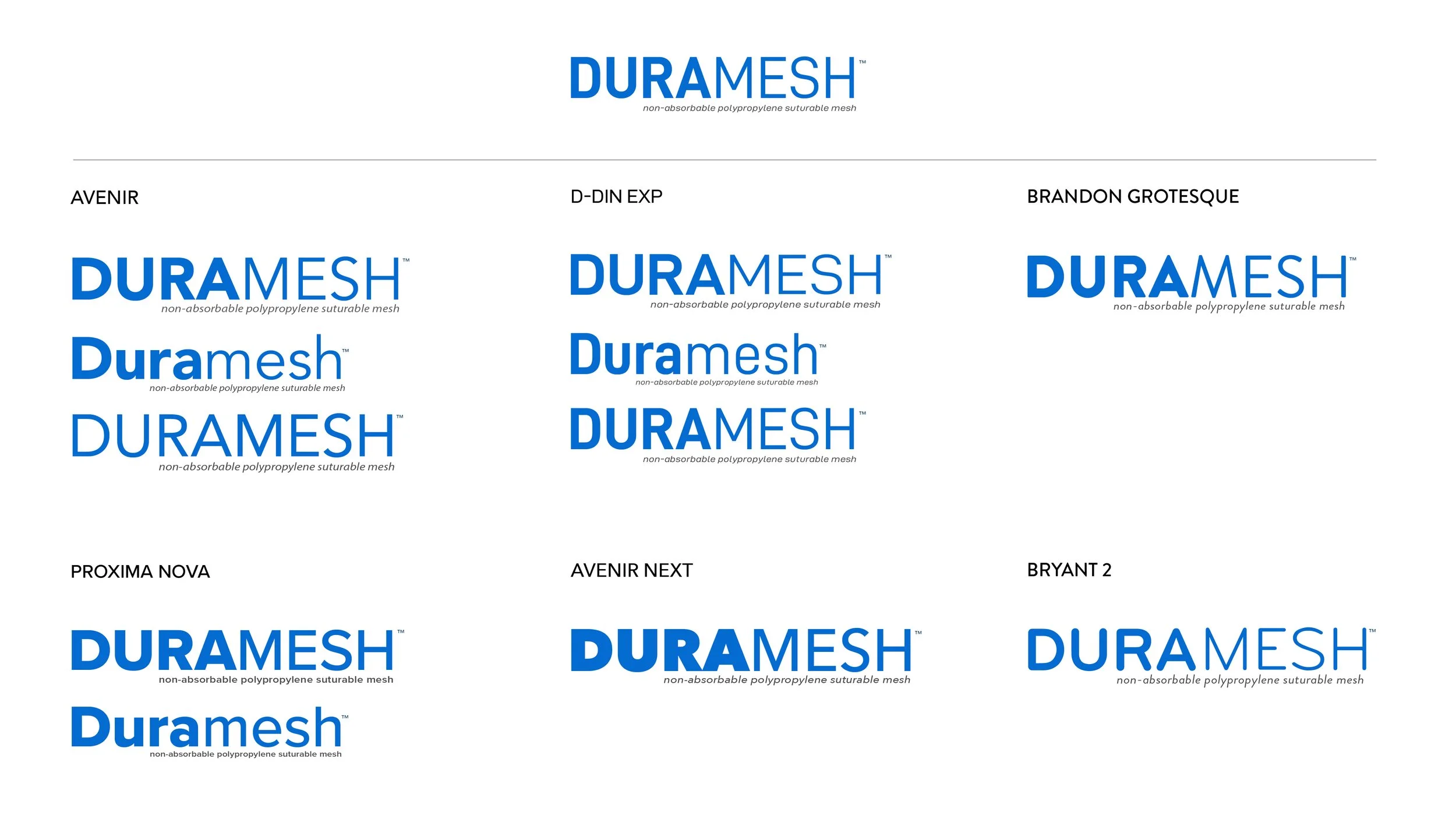
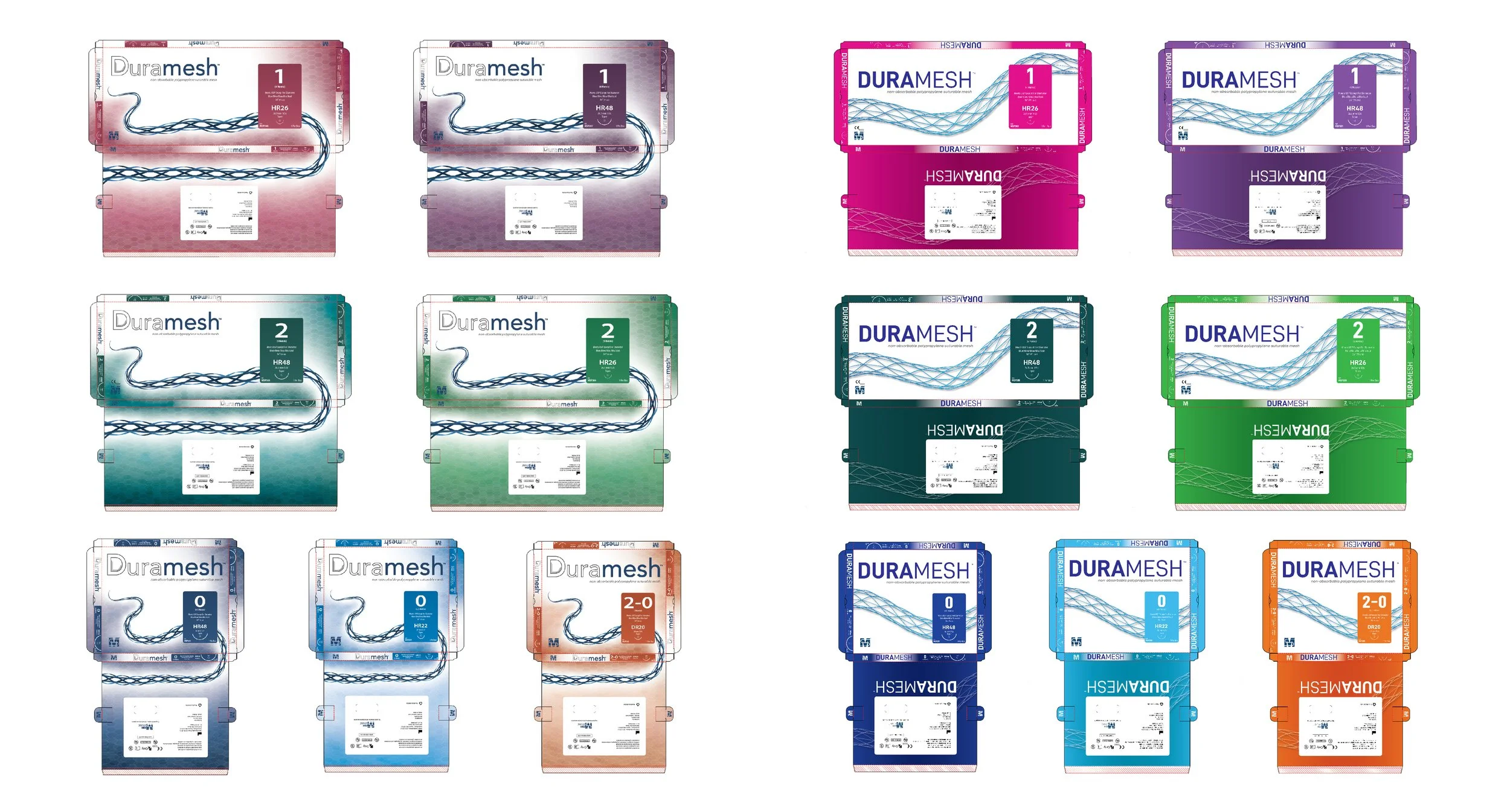
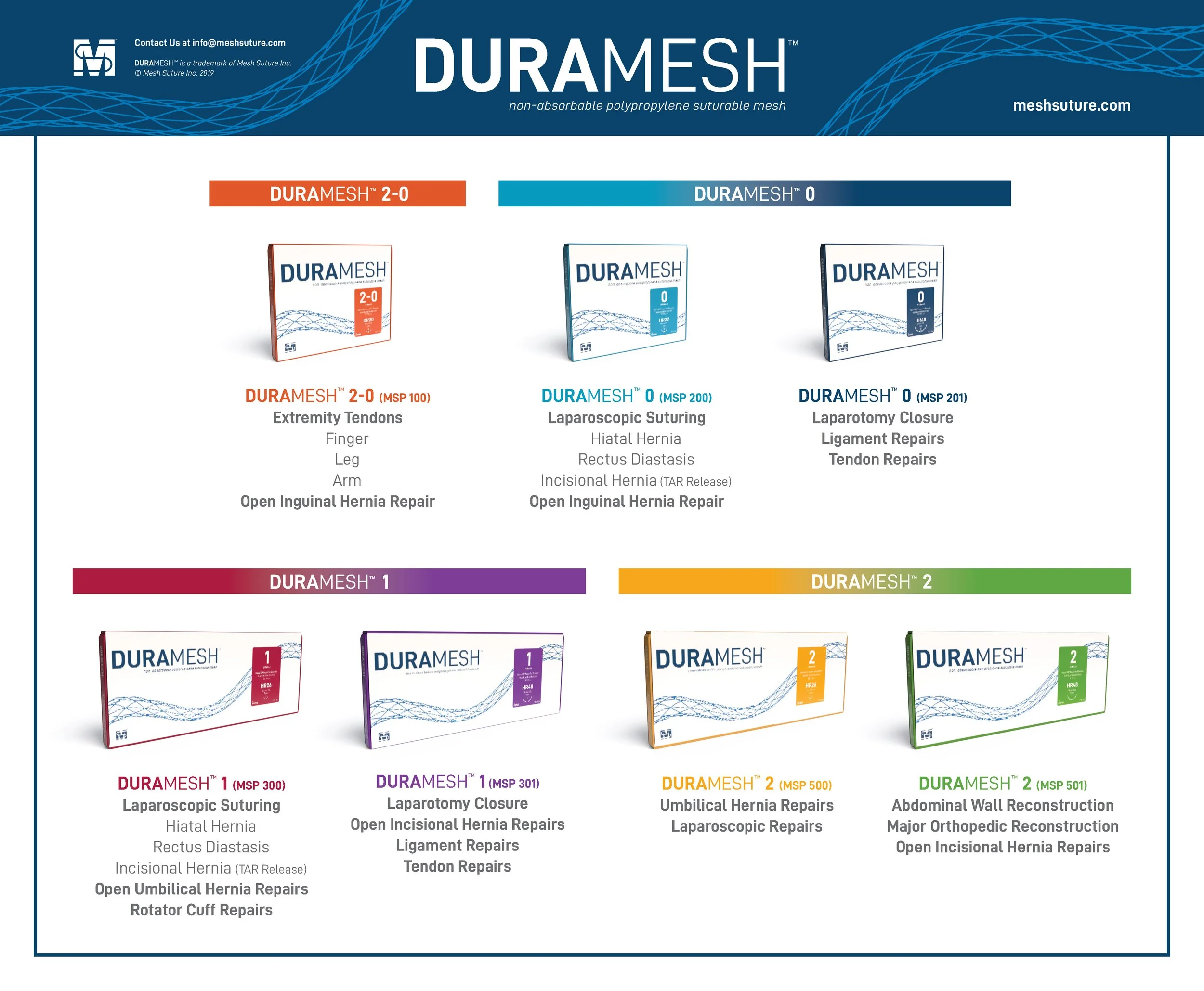
We created a clean, sophisticated DURAMESH logo that mirrors the precision and integrity of Mesh Suture’s engineering. The final packaging suite features seven bright, contrasting citrus-inspired colors—each SKU distinguished by its own vibrant hue while maintaining a unified layout. This system ensures strong shelf presence in clinical environments while presenting a cohesive, professional family of products.
The refreshed DURAMESH brand and packaging elevate Mesh Suture’s identity within the global medical market, positioning the company at the forefront of innovation in mesh sutures.